YOUR CALMING COLOR PALETTE
Are you building a brand focused around creating a calm state for your customers? If so, your colors will play a crucial role in evoking those feelings.
Hint: muted blues and certain shades of green are your best friend.
THE POWER OF MUTED BLUES
If you’re going for the opposite of a Times Square anxiety vibe then you’ll want to shy away from super bright saturated colors. Desaturated colors and neutrals will go a long way when it comes to dampening that anxiety. But even better are desaturated versions of blue.
There’s a reason those tropical ocean pics feel so relaxing. It’s one part association and one part color theory.
Or maybe it’s that our psych has built-in color associations that trigger important primal responses? Hmm…I gotta look into that one. Obviously I’m no expert. (If anyone knows about that research please pass it along).
This calming color palette is perfect for you if:
- Your brand is focused on combating people’s anxiety.
- Your brand stands for slowing down and living in the moment.
- You want people to be calm and focused when they consume your content.
- You’re all about solitude and inward reflection.
SWIPE IT
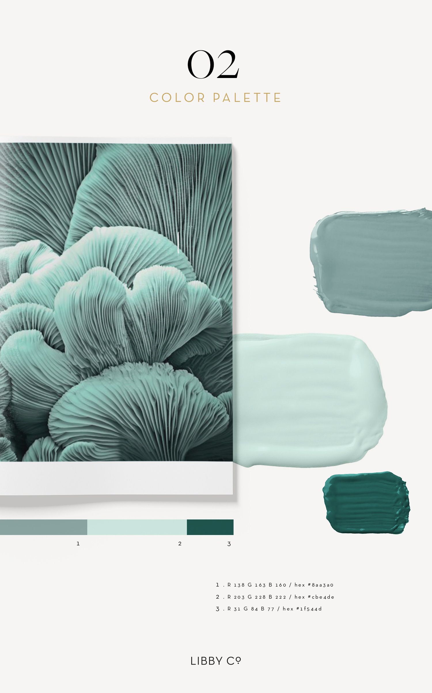
If you’re getting a headache and second guessing your color choices as we speak, feel free to swipe this exact palette and use the color specs outlined on the image above. It’s designer approved and each color goes with the next so you can feel good knowing it works.
Or if you’re feeling your creativity kick in and you want to vary it slightly pin it as inspiration and tweak it for you.
I WANT TO HELP
I’d love to hear from you. Are you trying to create a brand that is grounded in creating a calming vibe? What do you need help with when it comes to composing the perfect colors? Pop any questions in the comments and I’ll jump on it :)
Enjoy!
Libby

